I rendered 1,418 Unicode confusable pairs across 230 fonts. Most aren't confusable to the eye.
96.5% score low on visual similarity. But 82 pairs are pixel-identical in at least one font.
The gap
In an earlier post, I listed font-rendering attacks as an explicit limitation:
Two characters might have identical Unicode skeletons but render differently in specific fonts, or have different skeletons but render identically in a particular typeface. Detecting this requires rendering glyphs and comparing pixel output. No purely Unicode-data-based approach handles it, and UTS #39 does not attempt to.
That was the gap. confusable-vision is the tool I built to close it: render every confusable pair, measure the pixels, and put a number on what “visually confusable” actually means.
What confusable-vision does
confusable-vision takes the 1,418 TR39 confusable pairs that map a non-Latin character to a Latin target (a-z, 0-9), renders both characters across every available system font, and computes SSIM for each pairing. The output is a scored JSON artifact: one continuous similarity score per pair, per font.
SSIM (Structural Similarity Index Measure) compares two images by evaluating luminance, contrast, and structural patterns across local windows. It returns a score from -1 to 1: 1.0 means the images are pixel-identical, 0 means no structural correlation, and negative values mean the images are anti-correlated (less alike than random noise). For glyph comparison, it answers the question: do these two rendered characters share the same visual structure?
The pipeline has two stages:
-
build-index renders all 1,418 source characters and 34 target characters as 48x48 greyscale PNGs, one per font that natively contains the character. Fontconfig is queried per-character to avoid brute-force rendering across all 230 fonts (97% reduction: 8,881 targeted renders vs 326,140 brute-force).
-
score-all-pairs loads the render index and computes SSIM for every valid source/target combination. 235,625 comparisons, two modes: same-font (both characters in the same font) and cross-font (source in a supplemental font, target in a standard font).
Greyscale rendering is deliberate. Gupta et al. (2023, “GlyphNet”) found that greyscale outperforms colour for glyph comparison because extreme contrast preserves edge detail through resize. No image augmentation either: flipping or rotating characters creates unrealistic glyphs.
Why SSIM, not learned embeddings
SSIM was chosen over CNN-based approaches for a deliberate reason: reproducibility without infrastructure. SSIM is a deterministic mathematical function. No training data, no model weights, no GPU, no framework dependencies. Anyone with fontconfig and node-canvas can reproduce these exact numbers on the same platform.
GlyphNet’s own results support this: their best CNN (VGG16 fine-tuned on rendered glyphs) achieved 63-67% accuracy on domain-level binary classification. Learned features do not dramatically outperform structural similarity for glyph comparison, and they introduce model versioning concerns and training corpus dependencies. For a dataset intended to feed into security policy, determinism and auditability matter more than marginal accuracy gains.
Font discovery
Rather than a hardcoded font list, confusable-vision auto-discovers every system font that contains Latin a-z:
fc-list ':charset=61-7A' --format='%{file}|%{family[0]}\n'On this macOS system, that produces 230 fonts across five categories:
| Category | Count | Purpose |
|---|---|---|
| standard | 74 | Latin-primary fonts: Arial, Menlo, Georgia, Helvetica, etc. |
| script | 49 | CJK, Indic, Thai fonts that also contain Latin glyphs |
| noto | 103 | Noto Sans variants for non-Latin scripts |
| math | 3 | STIX Two Math, STIX Two Text, STIXGeneral |
| symbol | 1 | Apple Symbols |
Only “standard” fonts are used for target rendering. All categories can supply source renders. This captures the realistic browser scenario: your page text is in Arial, but the OS picks Noto Sans Tifinagh for the exotic character.
The headline: 96.5% of confusables.txt is not high-risk
| Band | Count | % | Description |
|---|---|---|---|
| High (>= 0.7) | 49 | 3.5% | Genuinely dangerous |
| Medium (0.3-0.7) | 681 | 48.0% | Depends on font and context |
| Low (< 0.3) | 611 | 43.1% | Not visually confusable |
| No data | 77 | 5.4% | No system font covers the source character |
Median mean SSIM across all 1,341 pairs with data: 0.322. The typical confusables.txt entry is not visually confusable at all.
This does not mean confusables.txt is wrong. It means confusables.txt is a visual-similarity claim that has never been empirically validated at scale. Many entries map characters to the same abstract target under NFKC decomposition (mathematical bold A to A, for instance), and the mapping is semantically correct even if the glyphs look nothing alike. But if you treat every confusables.txt entry as equally dangerous for UI security, you are generating massive false positive rates for 96.5% of the dataset.
But 82 pairs are pixel-identical
Mean SSIM understates the threat. Max same-font SSIM reveals it.
A pair like Cyrillic ԁ (U+0501) and Latin d scores 0.781 mean SSIM across 18 fonts. That sounds moderate. But it is pixel-identical (SSIM 1.000) in eight of those fonts: Arial, Menlo, Cochin, Tahoma, Charter, Georgia, Baskerville, and Verdana. An attacker needs only one font to succeed. The exploitable risk is the max, not the mean.
82 pairs hit SSIM >= 0.999 in at least one font. They break into distinct groups.
Cyrillic homoglyphs: the real threat
The core Cyrillic lowercase confusables are pixel-identical across 30-44 standard fonts:
| Source | Target | Identical in N fonts |
|---|---|---|
| а (U+0430) | a | 40+ of 43 |
| е (U+0435) | e | 40+ of 44 |
| о (U+043E) | o | 40+ of 43 |
| р (U+0440) | p | 40+ of 46 |
| с (U+0441) | c | 40+ of 43 |
| у (U+0443) | y | 35+ of 41 |
| х (U+0445) | x | 40+ of 45 |
Every standard font that includes Cyrillic reuses the Latin glyph outlines. This is a deliberate font design decision, not a rendering quirk. No visual inspection can distinguish them.
The practical implication: a string like “аpple.com” with Cyrillic а (U+0430) is pixel-identical to “apple.com” in 40+ fonts. The user, the browser’s address bar, and any visual review process all see the same pixels. This is not theoretical. It is a measured property of the font files shipping on every Mac.
Roman numerals: glyph reuse by design
Roman numeral characters (U+2170-U+217F) are pixel-identical to their Latin equivalents in 36 fonts:
| Source | Target | Identical in N fonts |
|---|---|---|
| ⅰ (U+2170) | i | 36 |
| ⅴ (U+2174) | v | 36 |
| ⅹ (U+2179) | x | 36 |
| ⅼ (U+217C) | l | 38 |
| ⅽ (U+217D) | c | 36 |
| ⅾ (U+217E) | d | 36 |
| ⅿ (U+217F) | m | 36 |
Unicode encodes these as separate codepoints for compatibility, but fonts use the same glyph. These are easy to handle (NFKC collapses them), but worth knowing about.
Greek: mostly fine, with exceptions
Greek omicron (ο, U+03BF) is as dangerous as Cyrillic o: pixel-identical in 40+ fonts. But Greek rho (ρ, U+03C1, which maps to p) is pixel-identical only in Phosphate and Copperplate, two geometric/all-caps fonts where the structural distinction between rho and Latin p collapses. This is font-specific risk, not script-wide risk.
Hebrew Paseq: a non-obvious finding
Hebrew Paseq (U+05C0), which maps to lowercase l, scores 0.923 mean SSIM. This is Hebrew punctuation, not a letter, yet it renders as a vertical bar nearly identical to l. Think “paypa׀.com” with Paseq replacing the L. It scores 0.997 in Tahoma, 0.988 in Arial Unicode MS, 0.951 in Microsoft Sans Serif. The scoring surfaces it correctly.
Same-font vs cross-font: font pairing matters
| Mode | Comparisons | Mean SSIM |
|---|---|---|
| Same-font | 5,745 | 0.536 |
| Cross-font | 229,929 | 0.339 |
Same-font comparisons score 59% higher. When a font designer includes both Cyrillic and Latin, the glyph outlines are often intentionally harmonised or identical. Cross-font comparisons mix different design philosophies, which naturally reduces similarity.
This distinction matters for security. The same-font scenario is the dangerous one: a single font that renders both the spoofing character and its Latin target. Cross-font comparisons are closer to what browsers do (supplemental fonts for exotic characters), but the similarity drops significantly.
Which fonts are most dangerous?
Not all fonts contribute equally to confusability. The “danger rate” measures what percentage of a font’s supported confusable pairs score >= 0.7:
Highest danger rate
| Font | Pairs | High (>= 0.7) | % high |
|---|---|---|---|
| Phosphate | 77 | 52 | 67.5% |
| Copperplate | 103 | 69 | 67.0% |
| Chalkboard | 20 | 12 | 60.0% |
| Verdana | 64 | 36 | 56.3% |
| PT Serif Caption | 49 | 27 | 55.1% |
| Big Caslon | 26 | 14 | 53.8% |
| DIN Alternate | 78 | 41 | 52.6% |
Phosphate is a stencil-style font where many characters reduce to simple geometric forms. Copperplate is all-caps, eliminating case-based distinctions between scripts. These are the fonts where confusable pairs converge.
Lowest danger rate
| Font | Pairs | High (>= 0.7) | % high |
|---|---|---|---|
| Zapfino | 6 | 0 | 0.0% |
| Didot | 104 | 20 | 19.2% |
| Avenir Next Condensed | 76 | 15 | 19.7% |
| Futura | 59 | 12 | 20.3% |
Zapfino is an elaborate calligraphic font where every character has unique flourishes. No confusable pair looks similar in Zapfino. Condensed fonts also score lower because condensing transforms different characters differently.
This is, to my knowledge, the first published per-font danger rate analysis for Unicode confusables. It suggests that font choice is a meaningful variable in confusable risk, one that confusables.txt does not account for.
What this means for the web
The data shows that confusable risk is not a property of character pairs alone. It is a property of character pairs in a specific font. That has direct consequences for anyone building on the web.
Browser font fallback determines the threat. When a page specifies font-family: Arial, Helvetica, sans-serif and a string contains Cyrillic а, the browser checks Arial’s glyph tables, finds Cyrillic coverage, and renders it using Arial’s Cyrillic glyphs — which are pixel-identical to the Latin ones. The CSS font stack you ship determines which column of the danger rate table applies to your users. Arial at 40.8% is a different risk profile from Didot at 19.2%.
Users do not control the font. A content moderator reviewing flagged usernames sees whatever font the moderation tool renders. If that tool uses a system sans-serif (Arial, Helvetica, San Francisco), Cyrillic homoglyphs are invisible. If it used Zapfino, every pair would look different. The font is an uncontrolled variable in every visual review process.
Address bars are not immune. Browser address bars typically render in the system UI font (San Francisco on macOS, Segoe UI on Windows). Both are standard sans-serif fonts in the high-danger-rate category. Chromium’s IDN homograph protection catches many cases by displaying punycode for suspicious mixed-script domains, but it relies on script-mixing heuristics, not pixel comparison. A domain using only Cyrillic characters that happen to spell a Latin word (like “аpple” in all-Cyrillic) may still render in the address bar’s font and look identical.
Web fonts change the equation. Sites that serve custom web fonts via @font-face may inadvertently reduce or increase confusable risk depending on the font’s glyph design. A display font with distinctive Cyrillic letterforms would lower the danger rate. A geometric sans-serif that harmonises Latin and Cyrillic would raise it. Neither outcome is typically considered when choosing a web font.
The implication is that confusable detection systems should be aware of the rendering context. A warning that says “this string contains a confusable character” is less useful than one that says “this string contains a character that is pixel-identical to its Latin counterpart in the font your users will see.”
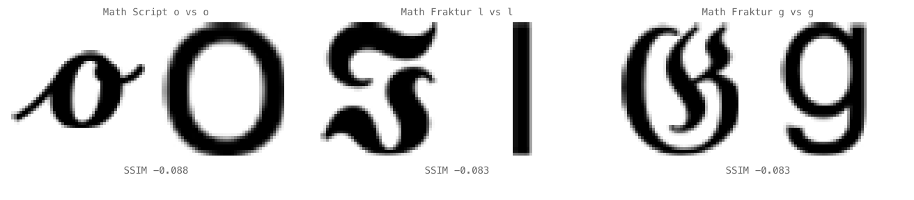
The false positives at the bottom
47 pairs have negative mean SSIM: the source and target are anti-correlated, sharing less structure than random noise. The worst offenders:
| Source | Target | Mean SSIM | Notes |
|---|---|---|---|
| Warang Citi digit (U+118EC) | x | -0.095 | Script digit vs Latin letter |
| Mathematical Script o (U+1D4F8) | o | -0.088 | Ornate calligraphic flourishes |
| Math Fraktur l (U+1D574) | l | -0.083 | Blackletter vs sans-serif |
| Math Fraktur g (U+1D50A) | g | -0.083 | Same issue |
These exist in confusables.txt because they map to the same abstract character under NFKC decomposition. The map is semantically correct. But from a visual perspective, these are false positives: a human would never confuse Mathematical Fraktur l with plain l.
Per-script breakdown
Different scripts show different risk profiles:
| Script/Block | Pairs | Mean SSIM |
|---|---|---|
| Latin Extended | 45 | 0.572 |
| Hebrew | 5 | 0.471 |
| Cyrillic | 45 | 0.447 |
| Cherokee | 37 | 0.398 |
| Indic | 24 | 0.359 |
| Greek | 36 | 0.329 |
| Math Alphanumeric | 806 | 0.302 |
| Arabic | 25 | 0.205 |
Latin Extended scores highest because phonetic extensions are deliberately designed to resemble their Latin base forms. Mathematical Alphanumeric Symbols dominate the dataset (806 of 1,418 pairs) but score low because ornate mathematical letterforms (script, fraktur, double-struck) look nothing like plain Latin in a different font. Arabic scores lowest: the letterforms are structurally different from Latin even when confusables.txt maps them as confusable.
Per-script thresholds would dramatically reduce false positive rates. Treating Mathematical Alphanumeric Symbols with the same urgency as Cyrillic makes no sense when the data shows a 0.145 gap in mean SSIM between them.
What this means for namespace-guard
The previous posts in this series built detection around TR39’s binary confusable map: a character either is or isn’t confusable. confusable-vision provides the empirical data to move beyond binary.
Three changes follow from these results:
1. Weight by max same-font SSIM, not binary membership. If any font produces SSIM >= 0.999, the pair is maximum risk regardless of how it scores in other fonts. Users do not control which font their browser chooses. The 82 pixel-identical pairs should be treated as definite blocks. The 49 high-scoring pairs should be treated as likely blocks. The 611 low-scoring pairs can be treated as informational warnings rather than hard rejections.
2. Separate same-font from cross-font scoring. Same-font comparisons (mean 0.536) are the strongest signal. A namespace validation system that weights same-font scores higher than cross-font scores will have better precision than one that treats all fonts equally.
3. Apply per-script thresholds. Cyrillic confusables at 0.447 mean SSIM require aggressive blocking. Mathematical Alphanumeric Symbols at 0.302 can be handled more permissively, especially since NFKC already collapses most of them. Arabic at 0.205 generates almost no genuine visual confusion and can be deprioritised entirely.
This moves confusable detection from “is this character in confusables.txt?” to “how confusable is this character, in which fonts, and at what threshold should we act?”
Limitations
macOS only. Windows and Linux ship different fonts with different glyph tables. Cross-platform scoring would require running on each OS or using freely distributable fonts.
48x48 resolution. Higher resolution might reveal subtle differences that 48x48 misses. GlyphNet found 256x256 optimal for CNN features; the tradeoff for SSIM at that resolution is worth investigating.
No contextual rendering. Cyrillic а is dangerous in “pаypal” but unremarkable in isolation. Context-aware scoring is a future milestone.
Regular weight only. Bold, italic, and condensed variants might score differently. The data already shows that condensed fonts score lower.
Single-character pairs only. Multi-character confusables (rn vs m, cl vs d) are outside scope. These are a known gap in confusables.txt itself.
How to reproduce
git clone https://github.com/paultendo/confusable-vision
cd confusable-vision
npm install

# Build render index (~160s, 11,370 PNGs)
npx tsx scripts/build-index.ts

# Score all pairs (~65s, 235,625 comparisons)
npx tsx scripts/score-all-pairs.ts

# Generate report statistics
npx tsx scripts/report-stats.ts
The full technical report is at REPORT.md in the repo, with per-font detail, appendices, and the complete top/bottom 30 lists. Every number in this post is reproducible from the commands above on macOS with the same system fonts.
confusable-vision is MIT-licensed. The scored data is CC-BY-4.0. The full technical report, 230-font analysis, and all render artifacts are in the repo. namespace-guard v0.18.0 (zero dependencies, MIT) ships all 1,397 SSIM-scored pairs as confusable weights, including 494 cross-script pairs between non-Latin scripts.
Thanks to Akshat Gupta and colleagues for the GlyphNet paper, whose empirical findings on greyscale rendering and glyph comparison informed confusable-vision’s methodology.