When shape similarity lies: size-ratio artifacts in confusable detection
11.5% of scored confusable pairs have extreme natural size differences. After normalisation they look identical. In running text they'd stick out.
Every visual confusable detection system I’ve seen works the same way: render two characters, normalise them to the same canvas size, measure structural similarity. confusable-vision does exactly this: trim whitespace, resize to 48x48, compute SSIM across 230 fonts.
This works well. But it has a blind spot.
The problem
When you normalise two characters to the same canvas, you throw away their natural size relationship. A CJK character that fills a full em-square and a Latin l that’s a thin vertical stroke both get scaled to fill 48x48 pixels. Their shapes might be structurally similar (both are vertical strokes), so SSIM scores them high.
But in running text at the same font size, one is 8x wider than the other. A human would never confuse them.
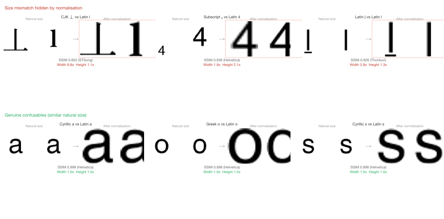
The top row shows three pairs that score well on normalised SSIM but have extreme size differences at natural rendering size. The bottom row shows genuine confusables with similar natural sizes.
Measuring the gap
I wrote a diagnostic script that re-renders every scored pair from three sources at their original 64x64 canvas size, measures the ink bounding box before normalisation, and computes width and height ratios between source and target:
- TR39 baseline (1,341 pairs with valid SSIM from
confusable-scores.json) - M2 novel discoveries (793 pairs from the novel discoveries scan)
- M2b CJK/Hangul (69 pairs from the CJK/Hangul scan)
That’s 2,203 pairs total, rendered across 2,760 unique (character, font) combinations.
Overall distribution
| Width ratio | Pairs | % |
|---|---|---|
| 1.0 - 1.25x | 1,177 | 53.4% |
| 1.25 - 1.5x | 439 | 19.9% |
| 1.5 - 2.0x | 307 | 13.9% |
| 2.0 - 3.0x | 187 | 8.5% |
| 3.0x+ | 93 | 4.2% |
254 pairs (11.5%) have a width or height ratio above 2.0x. These are shape-similar after normalisation but would be visually distinct at natural rendering size.
Breakdown by source
| Source | Total | Flagged | Rate |
|---|---|---|---|
| TR39 baseline | 1,341 | 70 | 5.2% |
| M2 (novel) | 793 | 154 | 19.4% |
| M2b (CJK/Hangul) | 69 | 30 | 43.5% |
TR39’s low rate is expected. The Unicode Consortium’s confusables.txt is curated by humans who intuitively account for size. Most TR39 pairs are cross-script look-alikes at similar natural sizes (Cyrillic a/Latin a, Greek o/Latin o). The 70 flagged TR39 pairs are mostly mathematical and script variants like ℐ (U+2110, Script Capital I) mapped to I, where the calligraphic form fills a wider bounding box.
M2b’s high rate makes sense. CJK and Hangul characters are designed for a full em-square grid. When compared against thin Latin letters like i, l, j, and t, the width ratio is extreme.
The worst offenders
The top entries by width ratio:
| Character | Target | Width ratio | SSIM | Dataset |
|---|---|---|---|---|
| 丄 (U+4E04) | l | 8.80x | 0.852 | M2b |
| 丅 (U+4E05) | l | 8.80x | 0.803 | M2b |
| ㄒ (U+3112) | i | 7.60x | 0.793 | M2b |
| ㄒ (U+3112) | l | 7.60x | 0.775 | M2b |
| ℐ (U+2110) | l | 7.50x | 0.349 | TR39 |
| 𝓘 (U+1D4D8) | l | 7.50x | 0.349 | TR39 |
| U+133FA | f | 7.00x | 0.749 | M2b |
The M2b entries all follow the same pattern: the source character contains a prominent vertical stroke (CJK ideographic or Bopomofo), and the Latin target is a thin vertical letter. After normalisation, both are vertical lines in a square. In running text, the CJK character would fill the full character cell while l occupies a fraction of it.
The TR39 entries are mathematical/calligraphic variants. ℐ (Script Capital I) and 𝓘 (Mathematical Script Capital I) are mapped to I/l in confusables.txt, but their calligraphic strokes fill a much wider bounding box than a plain Latin letter. Their low SSIM (0.349) already reflects this: the shapes are not that similar even after normalisation. The size ratio provides a second, independent signal.
High-SSIM false positives
Four pairs score above 0.9 SSIM while having ratios above 2.0x. These are the most deceptive:
| Source | Target | SSIM | Width ratio | Height ratio |
|---|---|---|---|---|
| ₄ (U+2084) | 4 | 0.936 | 1.9x | 2.1x |
| ḻ (U+1E3B) | l | 0.926 | 2.8x | 1.3x |
| Ǐ (U+01CF) | i | 0.903 | 2.8x | 1.4x |
| ୲ (U+0B72) | j | 0.900 | 2.7x | 1.6x |
The subscript 4 case is notable: ₄ and 4 have nearly identical shape (the SSIM is 0.936), but ₄ is rendered at subscript size. A reader would immediately spot the size difference.
Why 2.0x?
The threshold isn’t arbitrary. Legitimate confusable multi-character sequences like rn (mimicking m) have width ratios of around 1.5-1.8x. Two narrow characters are naturally wider than one character, but the shapes genuinely overlap at reading distance. A 2.0x threshold gives margin above these genuine cases while catching the artifacts.
Height ratios are more forgiving. Characters with descenders (j, g, y) or ascenders (l, d, b) naturally vary in height, and a 1.3x height ratio is unremarkable. Only 10 pairs exceed 2.0x on height, and most involve subscript or superscript characters.
What this means for detection
The size ratio doesn’t invalidate the SSIM score. A pair with 0.85 SSIM and 8.8x width ratio genuinely has similar shape. But shape similarity alone isn’t enough to assess confusability. Context matters: how similar would these characters appear in a word, at normal text size, in a real font?
This suggests confusable detection should track two independent metrics:
- Shape similarity (SSIM after normalisation): are the shapes structurally similar?
- Size similarity (ink width/height ratio at natural rendering size): would a substitution be visible?
A pair that scores high on both is genuinely confusable. A pair that scores high on shape but low on size is a “normalisation artifact”: real shape similarity that doesn’t translate to practical confusability.
Changes made
Diagnostic script (scripts/diagnose-size-ratios.ts): Re-renders all 2,203 scored pairs across 2,760 unique (character, font) combinations. Measures raw ink width and height from the 64x64 canvas before normalisation. Reports flagged pairs, distributions, and a ranked list of the worst offenders. Outputs both human-readable tables and structured JSON.
Index format (IndexRenderEntry): Added optional inkWidth and inkHeight fields. Going forward, build-index.ts and build-index-m2b.ts capture raw ink dimensions at index build time using decodeAndFindBounds() on the raw render before normaliseImage(). This means future scoring pipelines can apply size-ratio filters without re-rendering.
M4 multichar pipeline (score-multichar.ts): Already applies a width-ratio gate (> 2.0x) and ink-coverage floor (< 3%) in the hot scoring loop, blocking pairs where unified normalisation would produce meaningless SSIM values. This was the initial fix that prompted the broader investigation.
namespace-guard LLM confusable map: Each entry in LLM_CONFUSABLE_MAP now carries widthRatio and heightRatio fields from the diagnostic data. Of 2,218 total pairs, 2,133 have measured ratios (1,340 TR39 + 793 novel). The remaining 85 TR39 entries lack SSIM data and get null ratios.
namespace-guard canonicalise() API: Added a maxSizeRatio option (default: 3.0). Novel pairs whose width or height ratio exceeds the threshold are skipped during confusable scanning. TR39 pairs and pairs without measured ratios always pass. Set maxSizeRatio: Infinity to disable the filter, or lower it (e.g. 2.0) for stricter filtering.
What’s next
The 1,949 clean pairs (width and height ratios under 2.0x) represent genuine confusables: similar shape, similar size, hard to distinguish in running text. The 254 flagged pairs are annotated rather than discarded, so downstream consumers can make context-appropriate decisions.
The raw diagnostic data is at data/output/size-ratio-diagnostics.json in the confusable-vision repo.
All code: confusable-vision on GitHub and namespace-guard on GitHub.
Series context
This is the tenth post in a series on Unicode identifier security:
- confusables.txt and NFKC disagree on 31 characters
- Unicode ships one confusable map. You need two.
- A threat model for Unicode identifier spoofing
- Making Unicode risk measurable
- I rendered 1,418 Unicode confusable pairs across 230 fonts
- 793 Unicode characters look like Latin letters but aren’t (yet) in confusables.txt
- 28 CJK and Hangul characters look like Latin letters
- Your LLM reads Unicode codepoints, not glyphs. That’s an attack surface.
- The new DDoS: Unicode confusables can’t fool LLMs, but they can 5x your API bill
- This post: size-ratio artifacts in confusable detection
confusable-vision is MIT-licensed. The diagnostic data is CC-BY-4.0. namespace-guard (v0.17.1, zero dependencies, MIT) integrates size-ratio data via widthRatio/heightRatio fields in LLM_CONFUSABLE_MAP and exposes maxSizeRatio in the canonicalise() API.